
History of the Logos of Our Legacy Organizations
(3HO, KRI and SDI)
Ravitej Singh Khalsa, the original graphic designer of the 3HO and KRI logos, shares about how the logos came to be
This story goes back to 1967-68 when I was studying design while in the graphic design program at California State University Long Beach. One of the courses was for letterforms and studying the history of letterforms going back to ancient times.
While in this course I researched how the Peace Symbol letterforms, and the forms might relate to communication.
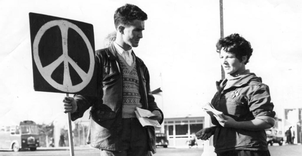
The peace symbol started out as the ban-the-bomb symbol.
In the 1950s the “peace sign”, as it is known today (also known as “peace and love”), was designed by Gerald Holtom as the logo for the British Campaign for Nuclear Disarmament (CND), a group at the forefront of the peace movement in the UK and adopted by anti-war and counterculture activists in the US and elsewhere.
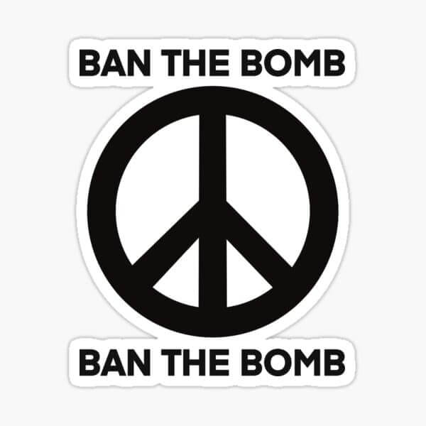
The Circle defines either the circle of life or the circle of fire. It is used both ways to define those aspects. The stick symbols are a symbol of “man”. And standing upright in a circle of life with arms raised to the heavens or God.
Turned over the “man” is dead and was seen as death by fire. Nuclear weapons were seen as the vehicle to bring about the death of man by fire. It came to be seen as an overall reason to have peace. And then simply became the peace symbol.
In my research, I found these symbols for many things. I thought about the “man” turned up, with hands reaching to the heavens, within a circle of life. Then I took it further to have three human characters with interlocking arms stretching to the heavens together in the circle of life. I called the symbol with three figures the “Brotherhood of Man” symbol.
I found these to be so compelling permanently etched them into my beloved art table. For future use. Someday I would find something that deserved this symbology.
Then I started to go to classes in Los Angeles taught by Yogi Bhajan and found those to be compelling. I got into yoga for a skateboard back injury. I was a competent and successful designer and Gurcharan Singh asked me if I would help KRI publishing….and these old symbols came to mind.
I shared the inverted Ban the Bomb symbol with Gurucharan. He indicated that the Elevation Kriya resembled the upward stick figure, uplifting an individual in the circle of life.
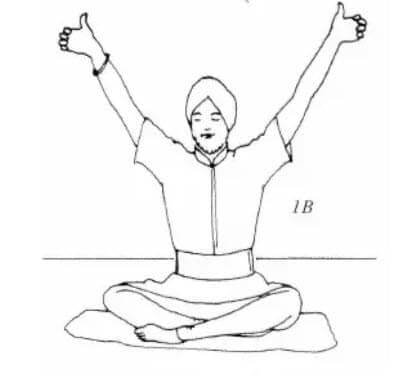
I worked on that for a little while and came up with the original and current KRI logo. The symbol for the uplifting of individual consciousness.
![]()
I moved to KRI in Pomona where I changed everything they did and created journals, magazines and yoga manuals. The last project I worked on for KRI was the Sadhana Guidelines Manual which helped support them for years.
In Los Angeles, I did many of the Beads of Truth Magazines, other Dharma projects and worked with Khalsa Computer in Pasadena.
In 1978, I moved to Eugene. The first project there was creating the book “Man Called the Siri Singh Sahib”, followed by many other projects. Additionally, was the Art Director at the CBS Television Affiliate.
![]()
While at a White Tantric Yoga Course in Seattle, the Siri Singh Sahib called me in. He said he wanted a new 3HO logo for the tenth-year anniversary. I shared the entire history with him. I told him about the symbology, about how the KRI logo was the symbol for the elevation of individual consciousness, and the other symbol was the Brotherhood of Man with arms interlocked and reaching to the heavens together – Group Consciousness.
I got a very big YES! And then we got down to sketching and talking about it.
He asked if we could have them holding up the world, because this technology would do that and we would become a worldwide effort, to uplift the consciousness of the entire world. Then he asked if the old 3HO logo of the words and triangle could be included somehow.
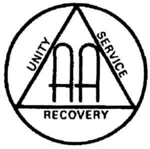 The triangle is the symbol of AA and has some like technology and consciousness. Many of the early adopters were also products of AA. We had found the symbology for the elevation of Group Consciousness and the rest was just hard work to make it right.
Upon completion, the symbol of Group Consciousness was introduced as the art for the cover of the 10th Anniversary issue of Beads of Truth.
![]()
The rest is simply history…
Having designed both the KRI and 3HO logos, I implemented graphic standards and graphic sheets that went out all over for use. We spread the two logos far and wide to include in the ultimate branding of the teachings. At the same time, I included a standardized Kanda or Ali Shakti symbol for all to use.
I did not design the Sikh Dharma International logo, but it followed the thread of design and branding perfectly. The five figures are a Panj of course, elevating the symbol of Sikhism. It was perfect.
The symbol of 8 figures (Prana) was never completed for KWTC. Or the badge of 10 figures in a circle (Guru Gobind Singh) for the Khalsa Army known as Akal Security.
The creation of the logos and branding was successful. Based on very simple universal symbology that everyone has some DNA memory of, it speaks to more than the intellect. This is why it feels so comfortable and is successful because of it.
In subsequent years we have digitized the logos. We have updated them, expanding the KRI logo to use for teacher teaching, etc. for example. Some tweaks are fine, but they need to keep giving the message of uplifting our consciousness, as part of humanity.
Sat Nam,
Ravitej Singh Khalsa
28 December 2023
